17 places where bristolassoc.com uses more than one value for the same kind of thing.
Each card on this page describes one place where the website currently uses more than one value for the same kind of thing — for example, two slightly different greens for the same kind of button. For every card, we show you each variation exactly as it appears on the site, tell you which one we recommend standardizing on and why, and give you a fair counter-argument. You then record one decision per card: agree with the recommendation, prefer one of the other variations, or leave things exactly as they are today.
To record a decision on a card, simply click the option you would like the site
to use — everything saves automatically, both your selection and anything you type in a
comment box. If you would rather keep things the way they are, click “Leave this one alone”
instead. Double-click any of the small screenshots to see a larger version, and the “See it
live” links open the real pages in a new tab.
One important note: choosing an option here does not change anything on
the website or on the Proposed preview pages. Your choices are collected first; once you have
been through the catalog, we apply the approved decisions in the next round and you review the
result before anything goes live.
Already unified — confirmThese two values were so close that we have already merged them in the proposed build.
Nothing is final — we are asking you to confirm the merge, and it can be undone if you
disagree.
Your callNothing has been changed for these yet. The site still shows every variation, and we
will not touch them until you make the call on the card.
Button green — already unified (confirm)
Already unified — confirm
Two nearly identical greens were used for the same primary buttons; the proposed build folds the older one onto the standard. The two columns below should look identical to you — the difference is nearly invisible to the eye, which is exactly why we merged them.
Click the option you want the site to use — or click
“Leave this one alone” below to keep things as they are. Double-click any small
screenshot to see it enlarged.
Your choice
Legacy green (was)
#2d953f · used in 24 places in the stylesheet
The older call-to-action green. Until this consolidation, it was still painting the form button on the Atlanta page.
As it appears on the location atlanta page.As it appears on the location atlanta page.
Your choice
Standard green (now)
#38934e · used in 37 places in the stylesheet
recommended
The site’s dominant call-to-action green — the one every green button now uses in the proposed build.
As it appears on the home page.As it appears on the home page.As it appears on the home page.
Your choice
Leave this one alone. Keep the different values exactly as they are on the site today — no change will be made.
Our recommendation: Applied in the proposed build: #2d953f is folded onto #38934e. Please confirm.
The case against it: None material — both are mid-greens; the change removes an inconsistency without altering the design.
A legacy blue on small contact icons is folded onto the brand blue in the proposed build. The two columns below should look identical to you — the difference is nearly invisible to the eye, which is exactly why we merged them.
Click the option you want the site to use — or click
“Leave this one alone” below to keep things as they are. Double-click any small
screenshot to see it enlarged.
Your choice
Legacy blue (was)
#003594 · used in 14 places in the stylesheet
An older blue that survived on the small contact icons and a few titles.
As it appears on the contact us page.As it appears on the contact us page.As it appears on the contact us page.
Your choice
Brand blue (now)
#295099 · used in 55 places in the stylesheet
recommended
The site’s dominant brand blue — the one everything is unified onto in the proposed build.
As it appears on the home page.As it appears on the home page.As it appears on the hospitality recruiters page.
Your choice
Leave this one alone. Keep the different values exactly as they are on the site today — no change will be made.
Our recommendation: Applied in the proposed build: #003594 is folded onto #295099. Please confirm.
The case against it: #003594 is a richer navy; #295099 is softer. If you prefer the deeper navy as the brand blue, we standardize the other way instead.
Beyond the brand blue, a darker navy is used on some headings and accents.
Click the option you want the site to use — or click
“Leave this one alone” below to keep things as they are. Double-click any small
screenshot to see it enlarged.
Your choice
Brand blue
#295099 · used in 55 places in the stylesheet
recommended
Headers, nav, links, footer.
As it appears on the home page.As it appears on the home page.As it appears on the hospitality recruiters page.
Your choice
Deep navy accent
#10368e · used in 8 places in the stylesheet
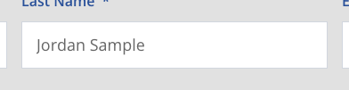
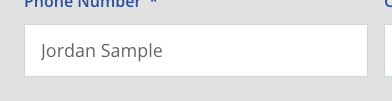
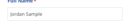
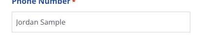
In practice this navy mostly paints form-field labels and a few small accents — the examples below show where it actually appears.
As it appears on the location atlanta page.As it appears on the location atlanta page.As it appears on the location atlanta page.
Your choice
Leave this one alone. Keep the different values exactly as they are on the site today — no change will be made.
Our recommendation: Keep #10368e as a distinct heading accent — a darker, higher-contrast navy reads better on headings than the medium brand blue.
The case against it: It is technically a third blue. If one-blue is the goal, headings fold onto #295099 too; the two are close enough that most viewers wouldn't notice.
Boxes, cards, and form fields are outlined in a few different light greys.
Click the option you want the site to use — or click
“Leave this one alone” below to keep things as they are. Double-click any small
screenshot to see it enlarged.
Your choice
Standard border grey
#d1d6de · used in 18 places in the stylesheet
recommended
Form fields and most boxes.
As it appears on the home page.As it appears on the home page.As it appears on the location atlanta page.
Your choice
Post-card grey
#e1e1e1 · used in 2 places in the stylesheet
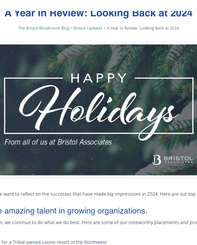
Blog/leader post cards.
As it appears on the blog a year in review page.
Your choice
Read-more grey
#d9d9d9 · used in 2 places in the stylesheet
Secondary buttons / read-more links.
As it appears on the hospitality recruiters page.As it appears on the hospitality recruiters page.As it appears on the hospitality recruiters page.
Your choice
Job-board dropdown border
#D4DDE9 · used in 1 place in the stylesheet
Found while reviewing your feedback doc — a fourth grey, only on the job-board filter dropdowns.
As it appears on the job board page.As it appears on the job board page.
Your choice
Leave this one alone. Keep the different values exactly as they are on the site today — no change will be made.
Our recommendation: Standardize borders on #d1d6de (already the dominant). Fold #e1e1e1 and #d9d9d9 onto it in a follow-up round.
The case against it: These greys are close enough that unifying them is very low-value — arguably not worth a change at all. Defer unless you want pixel-level consistency.
Click the option you want the site to use — or click
“Leave this one alone” below to keep things as they are. Double-click any small
screenshot to see it enlarged.
Your choice
Slate grey
#4f5965 · used in 12 places in the stylesheet
recommended
The redesign's body-text grey.
As it appears on the home page.As it appears on the home page.As it appears on the home page.
Your choice
Neutral grey
#666666 · used in 10 places in the stylesheet
Older component descriptions.
As it appears on the home page.As it appears on the home page.As it appears on the home page.
Your choice
Dark grey
#333333 · used in 2 places in the stylesheet
Table-of-contents text.
As it appears on the home page.As it appears on the home page.As it appears on the home page.
Your choice
Leave this one alone. Keep the different values exactly as they are on the site today — no change will be made.
Our recommendation: Standardize body text on #4f5965 (the redesign's grey). Fold #666 and #333 onto it in a follow-up.
The case against it: #666 and #4f5965 are perceptually close; #333 is deliberately darker for dense reference text. Unifying #333 could reduce readability there.
Buttons use three different corner radii, plus a dozen padding variants. (A fourth radius, 13px, exists in the stylesheet but never visibly appears on any page, so it isn’t shown here.)
Click the option you want the site to use — or click
“Leave this one alone” below to keep things as they are. Double-click any small
screenshot to see it enlarged.
Your choice
10px (plurality)
10px · used in 7 places in the stylesheet
recommended
Job-board and form-submit buttons.
As it appears on the job board page.As it appears on the job board page.As it appears on the job board page.
Your choice
14px
14px · used in 3 places in the stylesheet
The main CTA buttons.
As it appears on the home page.As it appears on the home page.As it appears on the home page.
Your choice
100px pill
100px · used in 1 place in the stylesheet
Secondary buttons.
As it appears on the hospitality recruiters page.As it appears on the hospitality recruiters page.As it appears on the hospitality recruiters page.
Your choice
Leave this one alone. Keep the different values exactly as they are on the site today — no change will be made.
Our recommendation: Propose 10px as the single radius (it has the plurality), but DEFER the change: no clean majority, and button padding/reflow is load-bearing. We want your direction before touching buttons.
The case against it: Leaving it means buttons keep three corner radii; changing it blind risks visible layout shifts we can't call cleanup.
Cards and panels cast several different drop-shadows for the same visual role.
Click the option you want the site to use — or click
“Leave this one alone” below to keep things as they are. Double-click any small
screenshot to see it enlarged.
Your choice
Soft 20px
0px 2px 20px rgba(0,0,0,0.1) · used in 8 places in the stylesheet
recommended
Job items, blog cards, images.
As it appears on the home page.As it appears on the home page.As it appears on the home page.
Your choice
Lifted 30px
0px 10px 30px rgba(0,0,0,0.07) · used in 4 places in the stylesheet
Search cards / standard-shadow boxes.
As it appears on the hospitality recruiters page.As it appears on the hospitality recruiters page.As it appears on the hospitality recruiters page.
Your choice
Diffuse 25px
0px 4px 25px #00000014 · used in 1 place in the stylesheet
FAQ cards.
As it appears on the location atlanta food and beverage recruiting and executive search page.As it appears on the location atlanta food and beverage recruiting and executive search page.As it appears on the location atlanta food and beverage recruiting and executive search page.
Your choice
Tight 5px
0 2px 5px rgba(0,0,0,.1) · used in 3 places in the stylesheet
Blog category chips.
As it appears on the blog bristol surveys category page.As it appears on the blog page.
Your choice
Leave this one alone. Keep the different values exactly as they are on the site today — no change will be made.
Our recommendation: Standardize cards on the soft 20px shadow (most common). Fold the others onto it in a follow-up.
The case against it: Some depth variation is intentional (chips vs large panels). A single shadow could flatten a deliberate hierarchy — worth a design look, not a blind sweep.
The main page title is set at several different sizes depending on the template.
Click the option you want the site to use — or click
“Leave this one alone” below to keep things as they are. Double-click any small
screenshot to see it enlarged.
To scale — the same words rendered at each size
45px — 45px · recommended
Casino & Gaming Executive Recruiting
40px — 40px
Casino & Gaming Executive Recruiting
38px — 38px
Casino & Gaming Executive Recruiting
35px — 35px
Casino & Gaming Executive Recruiting
Your choice
45
45px
45px · used in 4 places in the stylesheet
recommended
As it appears on the hospitality recruiters page.As it appears on the location atlanta page.As it appears on the jobs director of sales page.
Your choice
40
40px
40px · used in 3 places in the stylesheet
As it appears on the casino gaming recruiters surveys page.As it appears on the food and beverage recruiters surveys page.
Your choice
38
38px
38px · used in 1 place in the stylesheet
As it appears on the home page.As it appears on the this page does not exist phase0 page.
Your choice
35
35px
35px · used in 1 place in the stylesheet
As it appears on the blog a year in review page.
Your choice
Leave this one alone. Keep the different values exactly as they are on the site today — no change will be made.
Our recommendation: Propose a single page-title size (45px, the plurality) but DEFER — page titles sit in template-specific banners and a blanket change may crowd some layouts.
The case against it: Some size variation is deliberate (a blog post title vs a landing banner). A true type scale is its own design project, not a normalization sweep.
Section headings are set at several sizes across templates.
Click the option you want the site to use — or click
“Leave this one alone” below to keep things as they are. Double-click any small
screenshot to see it enlarged.
To scale — the same words rendered at each size
40px — 40px
Casino & Gaming Executive Recruiting
34px — 34px
Casino & Gaming Executive Recruiting
30px — 30px (dominant) · recommended
Casino & Gaming Executive Recruiting
22px — 22px
Casino & Gaming Executive Recruiting
Your choice
30
30px (dominant)
30px · used in 9 places in the stylesheet
recommended
As it appears on the home page.As it appears on the home page.As it appears on the home page.
Your choice
40
40px
40px · used in 2 places in the stylesheet
As it appears on the casino gaming recruiters surveys page.As it appears on the food and beverage recruiters surveys page.
Your choice
34
34px
34px · used in 1 place in the stylesheet
As it appears on the home page.As it appears on the home page.As it appears on the home page.
Your choice
22
22px
22px · used in 1 place in the stylesheet
As it appears on the home page.As it appears on the home page.As it appears on the home page.
Your choice
Leave this one alone. Keep the different values exactly as they are on the site today — no change will be made.
Our recommendation: Propose 30px as the standard section heading (clear dominant), DEFER the outliers pending a type-scale decision.
The case against it: Card/list headings (22px) are smaller on purpose. Forcing one size would break intended hierarchy in grids.
Sub-headings vary in size across components. (A 29px size also exists in the stylesheet but never visibly appears on any page, so it isn’t shown here.)
Click the option you want the site to use — or click
“Leave this one alone” below to keep things as they are. Double-click any small
screenshot to see it enlarged.
To scale — the same words rendered at each size
28px — 28px
Casino & Gaming Executive Recruiting
23px — 23px
Casino & Gaming Executive Recruiting
20px — 20px (dominant) · recommended
Casino & Gaming Executive Recruiting
Your choice
20
20px (dominant)
20px · used in 7 places in the stylesheet
recommended
As it appears on the home page.As it appears on the home page.As it appears on the home page.
Your choice
28
28px
28px · used in 2 places in the stylesheet
As it appears on the food and beverage recruiters surveys page.
Your choice
23
23px
23px · used in 1 place in the stylesheet
As it appears on the location atlanta food and beverage recruiting and executive search page.As it appears on the location atlanta food and beverage recruiting and executive search page.As it appears on the location atlanta food and beverage recruiting and executive search page.
Your choice
Leave this one alone. Keep the different values exactly as they are on the site today — no change will be made.
Our recommendation: Propose 20px as the standard sub-heading (dominant), DEFER outliers pending the type-scale decision.
The case against it: 28-29px sub-heads are used in dense reference sections where a larger sub-head aids scanning. One size may hurt those.
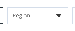
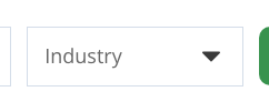
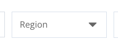
The text you type into forms and search bars is not one color. The blog search uses the standard form grey; the job-board search renders a near-black dark grey (it looks black to the eye — you flagged it as black in your feedback); and the job-board filter dropdowns use yet another dark grey.
Click the option you want the site to use — or click
“Leave this one alone” below to keep things as they are. Double-click any small
screenshot to see it enlarged.
Your choice
Standard form grey
#666666 · used in 4 places in the stylesheet
recommended
Placeholder text everywhere, and typed text in the blog search.
As it appears on the blog page.
Your choice
Near-black
#3E3E3E · used in 2 places in the stylesheet
Typed text in the job-board search bar — we typed a sample into the field for the screenshot. It reads as black, which is how you described it.
As it appears on the job board page.
Your choice
Darker grey
#3A3A3A · used in 1 place in the stylesheet
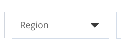
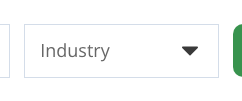
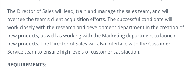
The job-board filter dropdowns (Region / Industry) and the resume-upload text on job pages, where the examples below come from.
As it appears on the jobs director of sales page.As it appears on the jobs director of sales page.As it appears on the candidates page.
Your choice
Leave this one alone. Keep the different values exactly as they are on the site today — no change will be made.
Our recommendation: Use the standard form grey (#666666) for all typed text, placeholders, and dropdown options — this is what you asked for on the Job Board and category pages.
The case against it: Black is higher-contrast and slightly easier to read. If legibility matters more than matching the other forms, standardize on black instead — either way it should be one color.
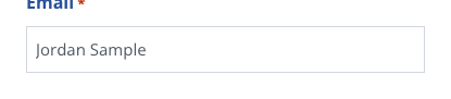
Most form fields show your typing at 18px, but the resume form on job pages renders at 15px — measurably smaller. You flagged this: “the font size that is typed in the boxes is different than the other forms.”
Click the option you want the site to use — or click
“Leave this one alone” below to keep things as they are. Double-click any small
screenshot to see it enlarged.
To scale — the same words rendered at each size
18px — Standard form size · recommended
Jordan Sample — jordan@example.com
15px — Resume-form size
Jordan Sample — jordan@example.com
Your choice
18
Standard form size
18px · used in 20 places in the stylesheet
recommended
Employer, candidate, and newsletter forms; blog and job-board search bars.
As it appears on the candidates page.As it appears on the candidates page.As it appears on the candidates page.
Your choice
15
Resume-form size
15px · used in 1 place in the stylesheet
The Submit Your Resume form on individual job pages (measured, not styled by the theme).
As it appears on the jobs director of sales page.As it appears on the jobs director of sales page.As it appears on the jobs director of sales page.
Your choice
Leave this one alone. Keep the different values exactly as they are on the site today — no change will be made.
Our recommendation: Give the resume form an explicit 18px rule so every form on the site matches.
The case against it: None, really — this is a straightforward consistency fix you already requested.
Most green buttons lighten when you mouse over them; four do not react at all — including the Submit buttons on the Employer and Candidate contact forms. You flagged the Submit button twice (Rounds 3 and 5).
Click the option you want the site to use — or click
“Leave this one alone” below to keep things as they are. Double-click any small
screenshot to see it enlarged.
Your choice
Lightens on hover
#43ac55 · used in 11 places in the stylesheet
recommended
The site standard: buttons brighten to this green on mouse-over. The screenshot below was captured while hovering over a button.
As it appears on the home page, captured while hovering over it.As it appears on the home page, captured while hovering over it.As it appears on the home page, captured while hovering over it.
Your choice
none
No hover effect
none · used in 4 places in the stylesheet
Employer & Candidate form Submit buttons, and the two employer buttons.
As it appears on the candidates page.
Your choice
Leave this one alone. Keep the different values exactly as they are on the site today — no change will be made.
Our recommendation: Add the same hover green to every button, so all buttons react consistently.
The case against it: No real counter-argument — this is the behavior you already asked for.
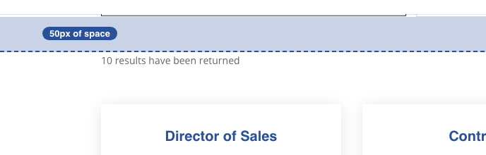
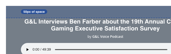
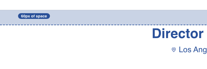
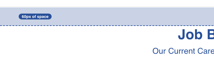
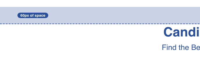
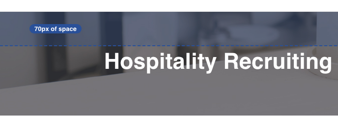
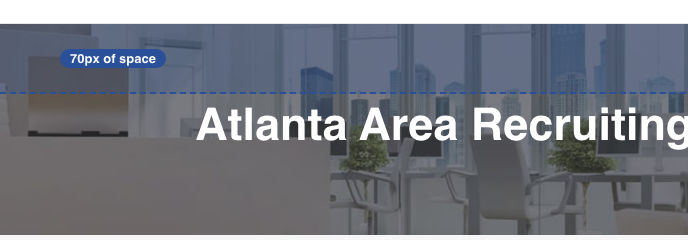
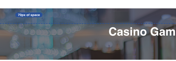
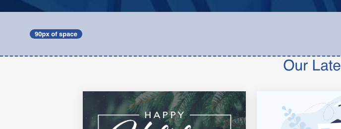
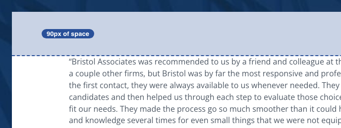
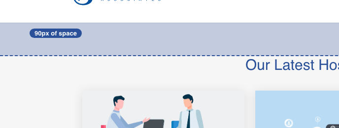
The vertical space above and below section headings varies from section to section (50, 60, 70, or 90 pixels). About a dozen of your open feedback items are versions of “match the spacing of the other sections” — they are all symptoms of the site not having one spacing standard.
Click the option you want the site to use — or click
“Leave this one alone” below to keep things as they are. Double-click any small
screenshot to see it enlarged.
Your choice
50
50px sections
50px · used in 5 places in the stylesheet
Job board listing area; the survey pages’ audio section.
As it appears on the job board page.As it appears on the casino gaming recruiters surveys page.
Your choice
60
60px sections
60px · used in 5 places in the stylesheet
recommended
Most of the newer, redesigned sections.
As it appears on the jobs director of sales page.As it appears on the job board page.As it appears on the candidates page.
Your choice
70
70px sections
70px · used in 2 places in the stylesheet
The survey pages’ top banner.
As it appears on the hospitality recruiters page.As it appears on the location atlanta page.As it appears on the casino gaming recruiters surveys page.
Your choice
90
90px sections
90px · used in 3 places in the stylesheet
The testimonial and blog sections on the home page.
As it appears on the home page.As it appears on the home page.As it appears on the hospitality recruiters page.
Your choice
Leave this one alone. Keep the different values exactly as they are on the site today — no change will be made.
Our recommendation: Adopt one spacing standard (60px, the most common on the redesigned sections) and bring the outliers — including the survey pages’ blue sections you flagged — in line with it.
The case against it: Some sections may deserve extra breathing room (e.g. the hero areas). If so, we standardize on two sizes — a normal and a large — rather than one.
The little triangle arrow in dropdowns is a black icon; the text next to it is grey. You asked for the arrow to match the grey form text — in Round 1 and again in Round 7.
Click the option you want the site to use — or click
“Leave this one alone” below to keep things as they are. Double-click any small
screenshot to see it enlarged.
Your choice
Black arrow (today)
#000000 · used in 2 places in the stylesheet
A black SVG icon used by the job-board filters and form dropdowns.
As it appears on the job board page.As it appears on the job board page.
Your choice
Form grey (proposed)
#666666 · not visibly used on any captured page
recommended
What the dropdown would look like with the arrow recolored to the form grey. This is a mock-up we generated for this review — it is not on the site yet.
Simulated preview on the job board page — a mock-up, not something on the site today.Simulated preview on the job board page — a mock-up, not something on the site today.
Your choice
Leave this one alone. Keep the different values exactly as they are on the site today — no change will be made.
Our recommendation: Recolor the arrow icon to the standard form grey, matching the text beside it.
The case against it: None — this is your own request; we just need your confirmation of the exact grey once the form-text decision above is made.
The * marking required form fields is blue on most forms (your site standard) but red on the resume form — the form plugin’s factory default leaking through. You flagged this: “make the red asterisks blue, to match the website standard.”
Click the option you want the site to use — or click
“Leave this one alone” below to keep things as they are. Double-click any small
screenshot to see it enlarged.
Your choice
Site blue
#295099 · used in 2 places in the stylesheet
recommended
Employer and Candidate contact forms.
As it appears on the location atlanta page.As it appears on the location atlanta page.As it appears on the location atlanta page.
Your choice
Plugin-default red
#C02B0A · used in 1 place in the stylesheet
The Submit Your Resume form on job pages (measured).
As it appears on the jobs director of sales page.As it appears on the jobs director of sales page.As it appears on the jobs director of sales page.
Your choice
Leave this one alone. Keep the different values exactly as they are on the site today — no change will be made.
Our recommendation: Make every required-field asterisk the site blue.
The case against it: Red is the near-universal web convention for “required” and is more noticeable. If accessibility/convention wins, switch the blue ones to red instead — but pick one.
On individual job pages, the bullet points under “Job Requirements” render bigger (18px) and in a different grey (#3A3A3A) than the description above them (16px, the standard slate grey). This matches your feedback: “text in the bullet points look a lot larger than the text above it.” (You also mentioned blue bullets — on the job page we captured, the bullets measure dark grey, so the blue may be limited to specific postings; we’ll confirm during the fix.)
Click the option you want the site to use — or click
“Leave this one alone” below to keep things as they are. Double-click any small
screenshot to see it enlarged.
To scale — the same words rendered at each size
18px — Bullet points
Five or more years of experience as an executive chef
16px — Description text (top) · recommended
Five or more years of experience as an executive chef
Your choice
16
Description text (top)
16px · used in 1 place in the stylesheet
recommended
16px in the standard slate grey #4F5965.
As it appears on the jobs director of sales page.As it appears on the jobs director of sales page.As it appears on the jobs director of sales page.
Your choice
18
Bullet points
18px · used in 1 place in the stylesheet
18px in a darker grey #3A3A3A — visibly bigger and darker than the text above.
As it appears on the jobs director of sales page.As it appears on the jobs director of sales page.As it appears on the jobs director of sales page.
Your choice
Leave this one alone. Keep the different values exactly as they are on the site today — no change will be made.
Our recommendation: Style the bullets to match the description text exactly (16px, slate grey), per your feedback — and green bullet markers if you still want them once we confirm where the blue ones appear.
The case against it: None — this is your own request, verified by measurement.
Did we miss something? If you have noticed an inconsistency on the site that is not
covered by any of the cards above — a color, a font, a spacing issue, anything at all —
describe it here and we will add it to the catalog. It saves automatically as you type.
Prefer to browse the pages? You can also walk the site page by page and flip each one
between its current and proposed styling on the Browse the pages view.